Barma
My journey at Barma began as an intern, eventually transitioning into the role of their graphic designer. Upon joining, I witnessed the brand in its initial stages, requiring substantial development. I played a pivotal role in shaping and establishing their brand identity, contributing significantly to both internal and external content creation.
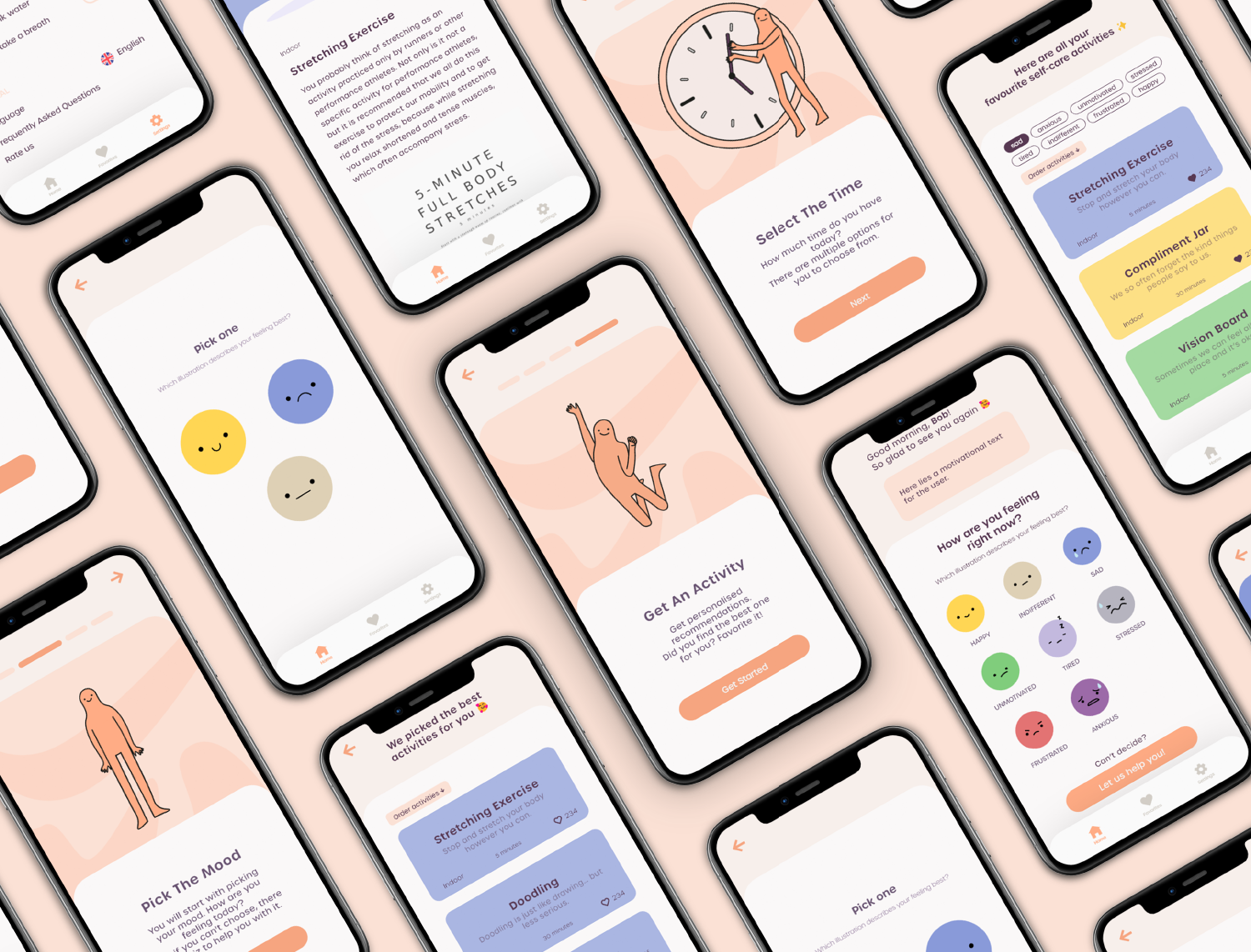
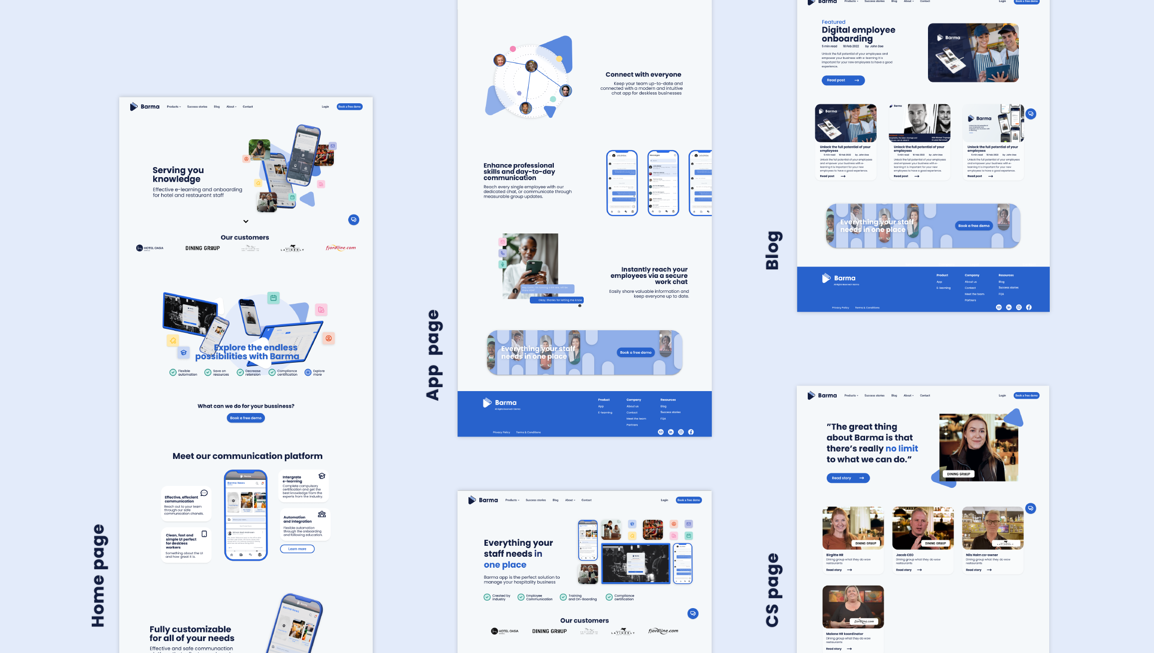
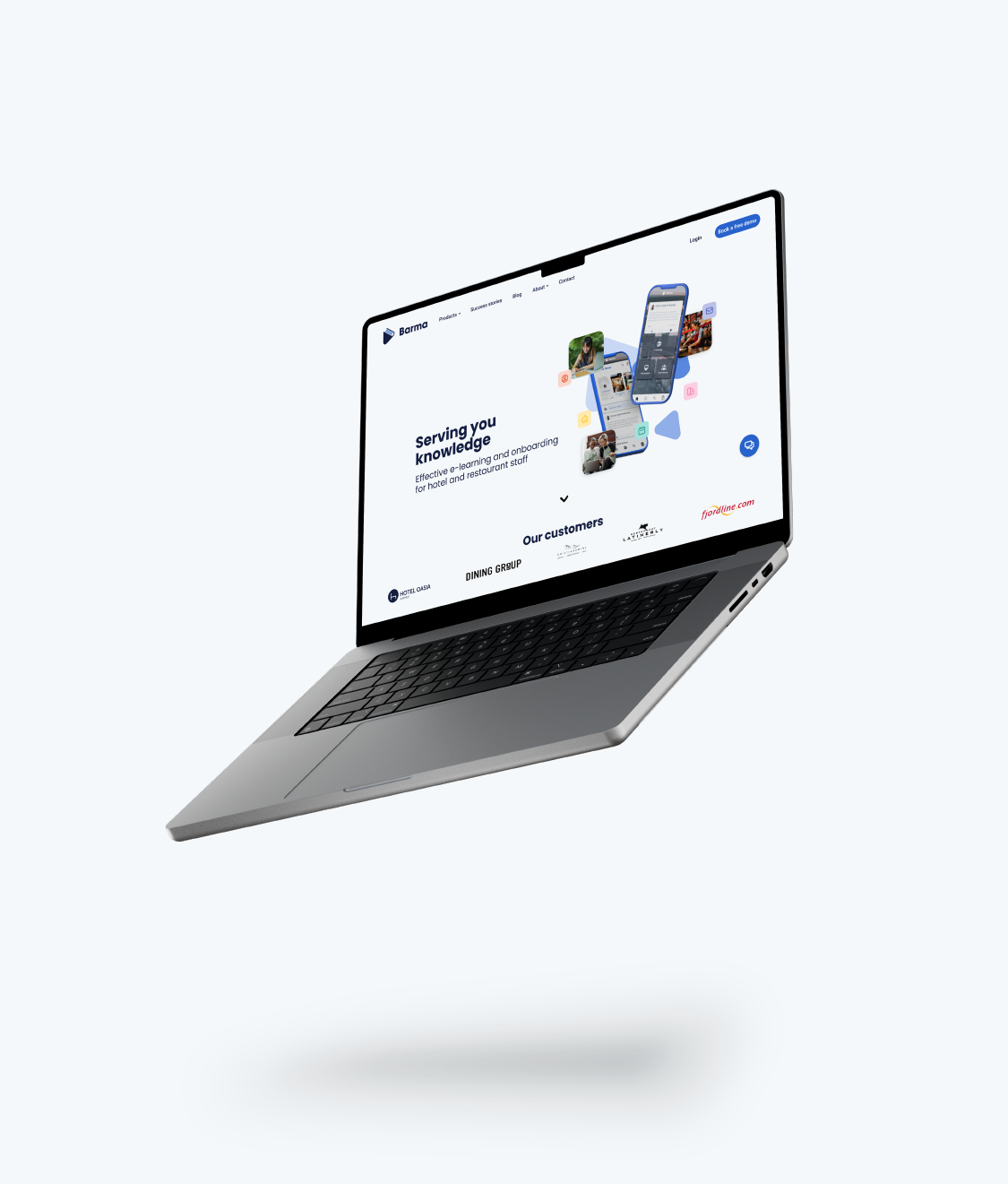
Creating the new website for Barma as the subject of my thesis. Unfortunately, the website is not live yet at this time.
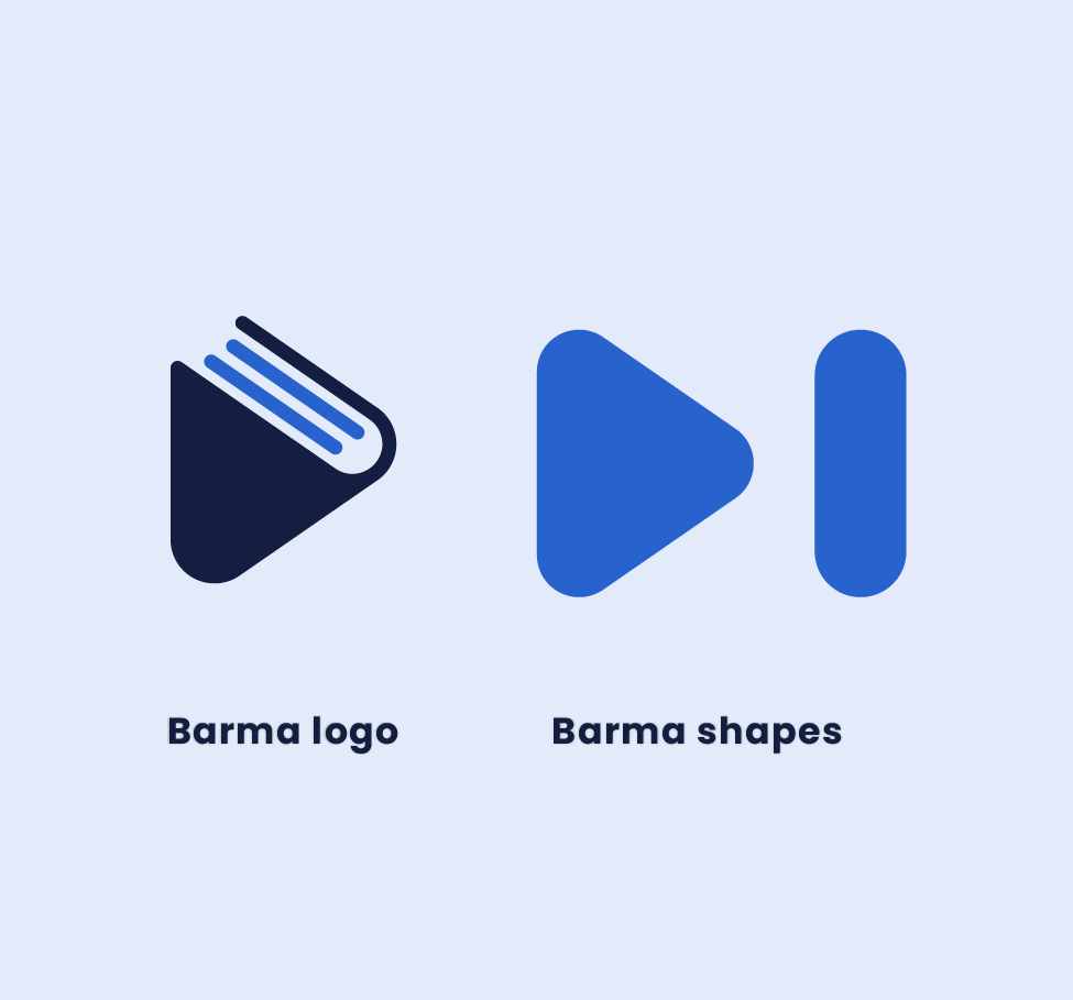
Another integral element of the logo is the play button, strategically included to symbolize the video aspect of their product.
Alongside the logo, I also created accompanying shapes. The first shape is a triangle, directly carried over from the Barma logo. The second shape, the oval, can also be found in the logo but more discreetly. Together, in their most basic form, they create the play and pause icons, which play into the video aspect of e-learning that Barma offers. These shapes were designed to support the brand in all visual presentations moving forward. They have been used externally in promotional materials as well as marketing campaigns. Additionally, they have been used in internal materials such as handbooks and presentations.
Reflecting on my journey at Barma, it's remarkable to see how my role as an intern evolved into that of a graphic designer, spearheading the development of the brand's identity. Joining Barma in its infancy provided me with a unique opportunity to contribute to its growth and evolution.
My initial significant undertaking at Barma was the design of the logo, a task that marked the beginning of my immersion into the realm of brand identity. At the time, the brand consisted primarily of a color palette and a typeface. In crafting the logo, I sought to encapsulate Barma's focus on e-learning by incorporating elements that symbolize knowledge and video content.The inclusion of a book motif in the logo was a deliberate choice, aimed at conveying the educational aspect of Barma's offerings. Additionally, the play button was strategically integrated to represent the video component of the product. These elements not only served to visually represent Barma's identity but also laid the foundation for its visual language moving forward.
In tandem with the logo, I also created accompanying shapes that would complement and support the brand in various visual contexts. The triangle, derived directly from the Barma logo, and the discreetly embedded oval were designed to evoke familiarity and continuity across all brand communications.
These shapes have since become integral components of Barma's visual identity, employed in both external promotional materials and internal communications. From marketing campaigns to internal handbooks and presentations, these elements have played a crucial role in establishing a cohesive and recognizable brand presence for Barma.
Working on the Barma project was my inaugural foray into the world of brand identity, and it proved to be a formative experience that laid the groundwork for my future endeavors in graphic design. It taught me the importance of thoughtful design choices in shaping a brand's identity and the power of visual elements in communicating its values and offerings.