ITU LAN
✦ A LAN party, for the uninitiated, is where people physically bring their computers or consoles to a shared space to play games together, side by side, in the same room. No online lobbies, no lag, just multiplayer chaos, shared snacks, and the kind of energy you can only get when everyone is fully present. It is a format that has been around since the early days of PC gaming, and one that has become increasingly rare in a world where everything has moved online. That is exactly what makes it worth preserving.✦
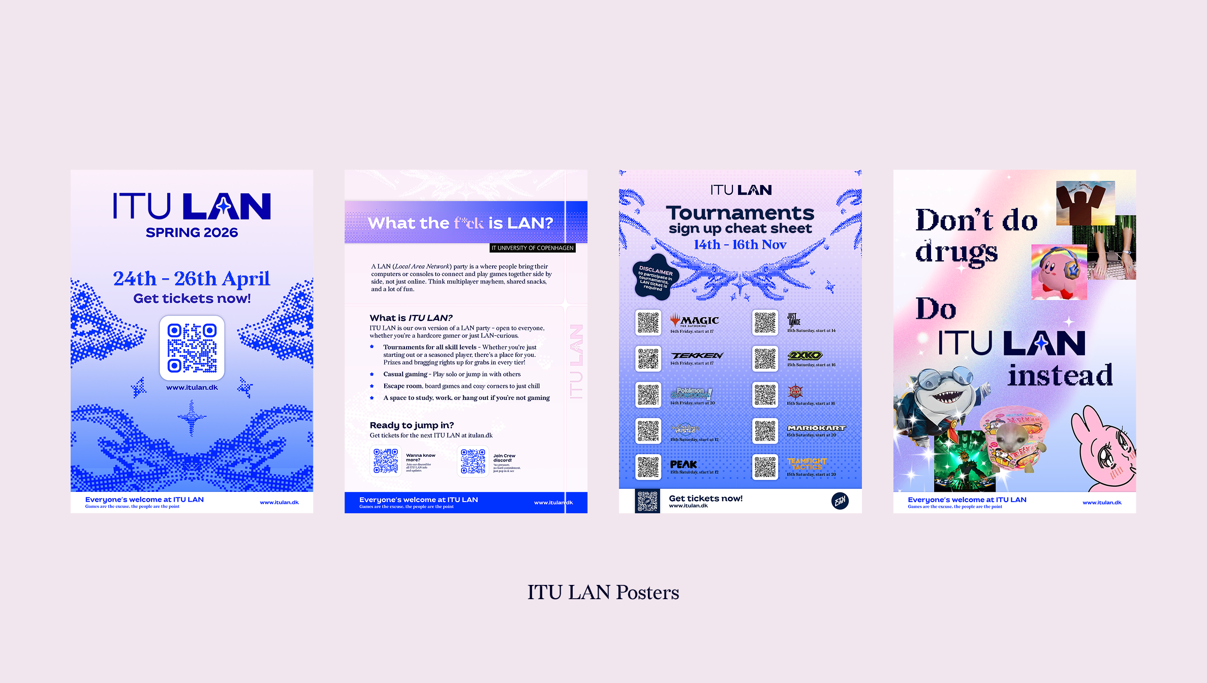
ITU LAN is the student-run LAN party at the IT University of Copenhagen, and being part of it has been one of the highlights of my time as a student. Around 200 people show up each time, and a big part of making that happen is making sure the event feels worth showing up for, both the experience itself and the way it is presented to the world.
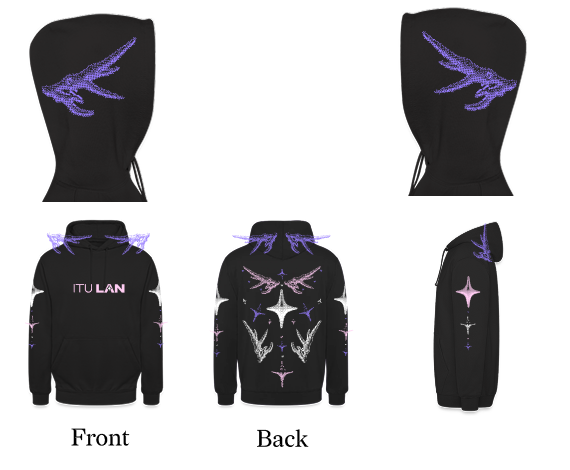
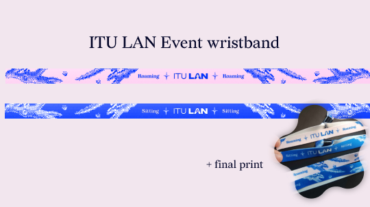
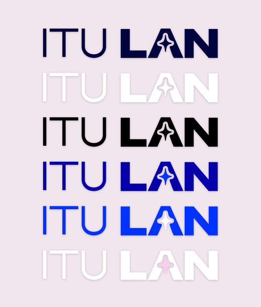
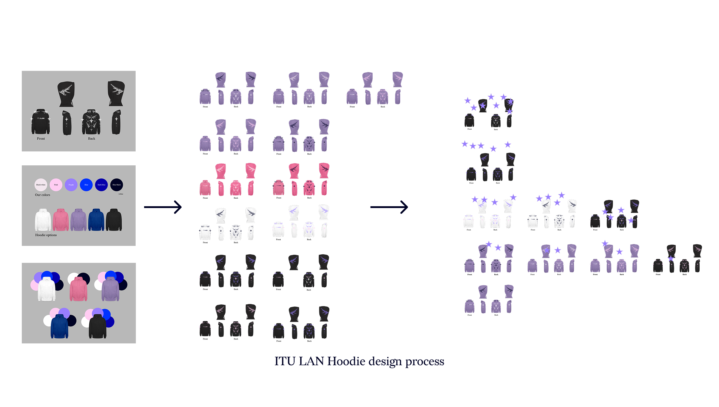
That is where I came in. As Head of Design and Board Member, I was responsible for the full visual identity of the organisation. I redesigned the brand from the ground up, creating a new logo and a visual language that actually reflected the community behind it. From there, my work spread across everything the organisation puts out. Promotional material for each event, social media graphics, and merchandise that people genuinely wanted to wear. There is something particularly satisfying about seeing someone walk around in a hoodie you designed, or watching an event sell out partly on the back of visuals you built from scratch.
Being part of ITU LAN reminded me that design is not just about looking good. It is about making people feel like they belong to something.
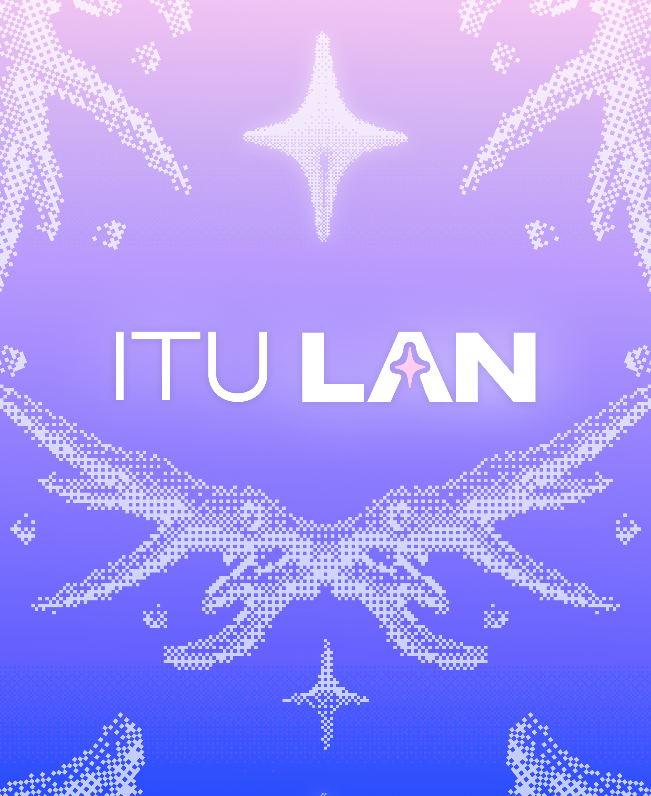
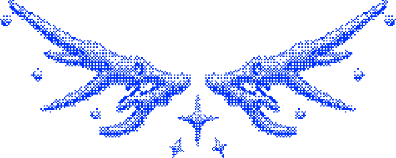
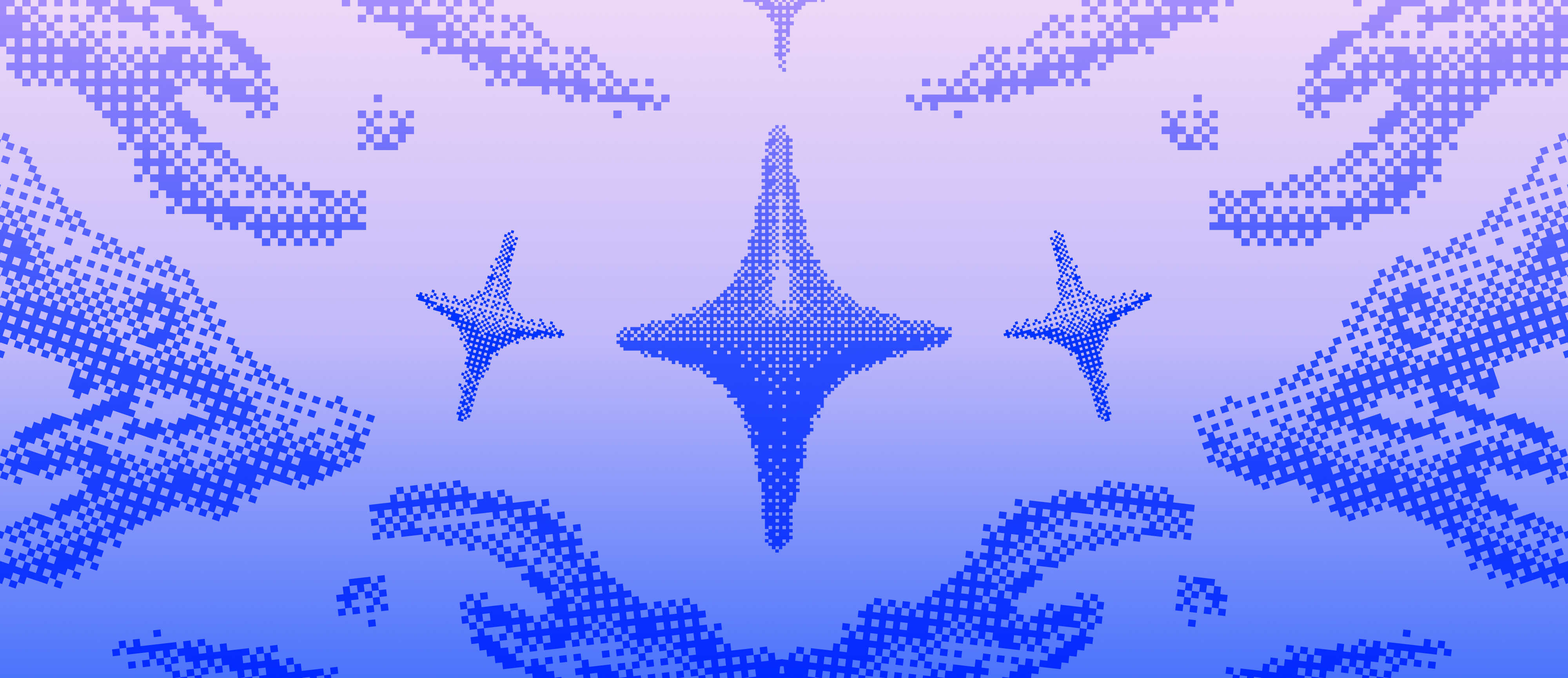
The design draws on the visual language of internet culture: gaming aesthetics, anime iconography, and the raw nostalgia of early digital graphics. Rather than polishing those references into something generic, I leaned into them deliberately. The motive feels at home on a screen, a hoodie, or a banner without losing its edge.
The defining technical challenge was dithering, a technique I hadn't worked with before. Dithering uses patterns of pixels to simulate gradients and shading, a method rooted in the constraints of early computer graphics. Applying it here wasn't just a stylistic nod to pixel art; it became the core visual language of the piece, giving the wings both texture and a distinctly digital, handcrafted quality that flat vectors couldn't achieve.
Designing for flexibility was central from the start. The motive needed to scale across contexts, merchandise, digital assets, event materials, while remaining coherent and recognisable. The high-contrast blue-on-black palette was chosen to ensure legibility and impact regardless of application.
ITU LAN taught me that great design does not need a big budget or a corporate brief behind it. Some of the work I am most proud of came from this organisation, built on nothing but a genuine love for the community and a desire to make something worth being part of. Designing for something you actually care about hits differently, and that is a feeling I want to bring into every project I take on.
Leading the visual identity of a live, student-run event with real audiences and real deadlines also gave me a confidence in my work that is hard to replicate in a classroom or a personal project. People showed up, they wore the merch, they shared the posters. That kind of direct feedback sharpens you quickly.
I am taking that with me. The ability to build something from scratch, own it fully, and see it land with an audience is exactly the kind of work I want to keep doing, just on a bigger stage.